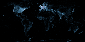
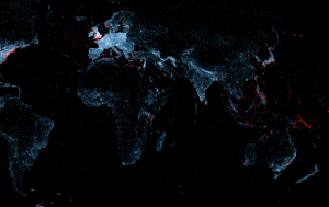
 What makes data analytics so interesting isn’t necessarily the volume of data, as an excellent example of data analysis showed on FastCompany this week, where they covered A Map of the Geographical Structure of Wikipedia by Olivier Beauchesne, a data scientist in Montreal. Beauchesne took geocoded articles from Wikipedia (meaning the writeup had a location associated) and drew a line between that article and associated articles. By doing so, he created new maps that showed the relationships between geographic locations and Wikipedia entries.
Secondary information
Something as simple as a geographic feature, like a mountain range, we would expect to see on the map. But what Beauchesne’s mapping techniques also show are how political, historical and non-geographical concepts (like music, wine and football) relate to geography. The geocoding of articles illuminates a secondary set of information…how those topics relate back to location and how that location relates to other factors, like colonial and ethnic boundaries.
Jazz and naval battles
 Where things get really interesting is when the Wikipedia topic is non-geographic, like “jazz” and the map suddenly shows density in areas across the US, but in particular on the West Coast and in the UK, Australia, Buenos Aires and West Africa. “Horse” shows the sites in the world where horse racing is most popular, which are clearly in the UK and Eastern US. The term “navy” shows the locations in the Pacific where major naval battles took place (see image to right).
All of this to say that visualization is a fast-growing and fascinating science. As data gets larger, faster and more varied, the ability to visualize to find new layers of relationship becomes critically important. Check out the results yourself on Beauchesne’s site.


 All Things D
 ARS Technica
 Engadget
 GigaOM
 Mashable
 TechCrunch
 The Verge
 Venture Beat
 Wired
Wired Chris Brogan
 Brian Solis
 Chris Dixon
 Clay Shirky Blog
 HBR Blog
 IT Redux
 Jeremiah Owyang
 Radar O'Reilly
 Seth Godin Blog
 SocialMedia Today
 Solve for Interesting
 The TIBCO Blog
 Lifehacker
