The following is a guest blog by Jesse Paquette.
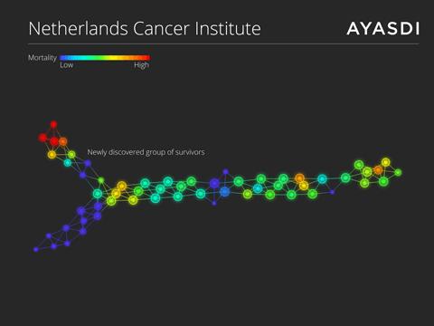
Everyone thought that The Netherlands Cancer Institute’s 12 year old dataset on breast cancer was old news. That was until a researcher with Merck & Co, Pek Lum, analyzed and visualized the dataset with the use of topological data analysis (TDA) and advanced machine learning technology. Her analysis landed her a featured story in the Wall Street Journal and, more importantly, allowed her to identify a previously unknown subgroup of cancer survivors that exhibited particular traits, a step forward in finding a cure.
Topological data analysis
Pek’s experience led her to become the Chief Data Scientist for Ayasdi, the company that created the software that was critical to her discovery. The Ayasdi Platform allowed Pek to leverage TDA to automatically construct a topological network of the cancer dataset. TDA is based on a branch of mathematics known as topology, the study of shape. Being able to use automation to find similarities within extremely complex datasets allows experts to discover new insights from analysis of the shape the data takes.
Let the data speak for itself
Instead of using more traditional methods of asking a question about a particular part of the data, Pek was able to look at the dataset in its entirety allowing the data to speak for itself. Pek was able to upload the breast cancer dataset into the Ayasdi Platform to create nodes of similar patients based on genetic make up. These nodes were then connected by edges between two or more nodes that shared a common patient. This created a complex venn diagram of relationships within the data. Further analysis of the topological network uncovered the subgroup of survivors and determine what traits made this group unique.
Driving breakthrough insights
TDA is changing the way domain experts around the world are looking at their data, and is offering a new framework in which many different algorithms can be cohesively used to automatically examine extremely complex datasets. More importantly, it allows mechanical engineers, financial service analysts, marketers, and oncologists to visualize their data in a new ways to drive breakthroughs insights.
Jesse Paquette (Lead, Translational Engineer):
Jesse leads the development of new features and pipelines that enhance user experience, particularly in the life science domain. Prior to Ayasdi, Jesse was a computation biologist at UCSF. He maintains an impressive collection of scar tissue, perpetuated be weekly overdoses of pick-up soccer.
Editor’s note: If you want to learn more about data visualization and the Big Data ecosystem, join us in New York for Interop.


 All Things D
 ARS Technica
 Engadget
 GigaOM
 Mashable
 TechCrunch
 The Verge
 Venture Beat
 Wired
Wired Chris Brogan
 Brian Solis
 Chris Dixon
 Clay Shirky Blog
 HBR Blog
 IT Redux
 Jeremiah Owyang
 Radar O'Reilly
 Seth Godin Blog
 SocialMedia Today
 Solve for Interesting
 The TIBCO Blog
 Lifehacker

Trackbacks/Pingbacks
[…] Curing cancer with data visualization (successfulworkplace.com) […]